The Formation of Biomolecular Condensates
Jo Mama, Physics & Mathematics, Arizona State University
Mentored by Dr. Jeremy Schmit
 |
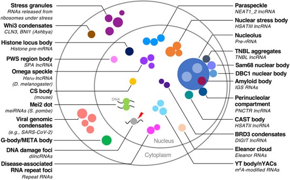 |
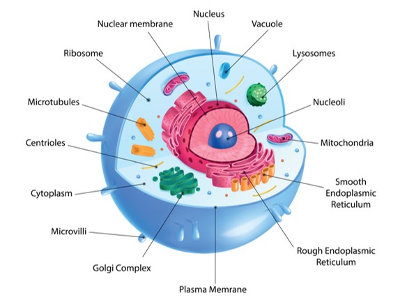
Fig. 1. Cell with organelles (left), cell its organelles which are in condensates.
Cells contain organelles, parts with distinct functions, analogous to organelles in the human body. Organelles can be separated from the rest of the cell with membranes, but they can also be membraneless, occurring inside a clump of molecules. The main body of these clumps are biomolecular condensates. The molecules composing the condensate also facilitate the chemical processes occurring inside of them, but we don’t understand this very well. The goal of this project was to model the formation of condensates using physics instead of more complex chemistry.
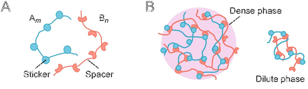
Fig. 2. The Sticker-Spacer Model.
We modeled the two molecules our condensate is made from as being composed of inert spacer parts which add length, and sticker parts which attack to stickers of other molecules, but not to the stickers from like molecules.
The molecules can be spread throughout the cell in the dilute phase, or crosslinked into a condensate in the dense phase.

Fig. 3. Statistical Mechanics.
Because we were modeling the behavior of large numbers of particles and their behavior as a group, statistical mechanics was the tool of choice.
Systems tend towards states with the lowest energy, so the Gibbs Free Energy is key to when condensates form. It should be energetically favorable.
One component of the Gibbs Free Energy involves entropy, which, in our system, is affected by the possible ways that each molecule’s stickers could bind to the stickers of any other molecule given the number of bindings which occur. More possibilities means higher energy, so the system tends towards states with fewer possible configurations.
Fig. 4. PolySH3 and PolyPRM molecules.
The specific system we studied was composed of the molecules PolySH3, which has 3 stickers and 2 spacers, and PolyPRM, which has 5 stickers and 4 spacers. PolySH3 is longer than PolyPRM.
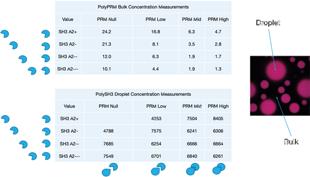
Fig. 5. Tables Of Experimental Data.
This is experimental data from the Rosen group at UT SW, showing how changing each molecule affects the condensate formed (or not formed, in the case of SH3 A2+ with PRM Null). The droplets are the dense phase, where the molecules are condensed, while the bulk is the dilute phase.
The variations of PRM change how strongly it binds with SH3, higher values meaning a stronger binding affinity.
The variations of SH3 change how attracted it is to itself, the lower values meaning stronger binding affinity.
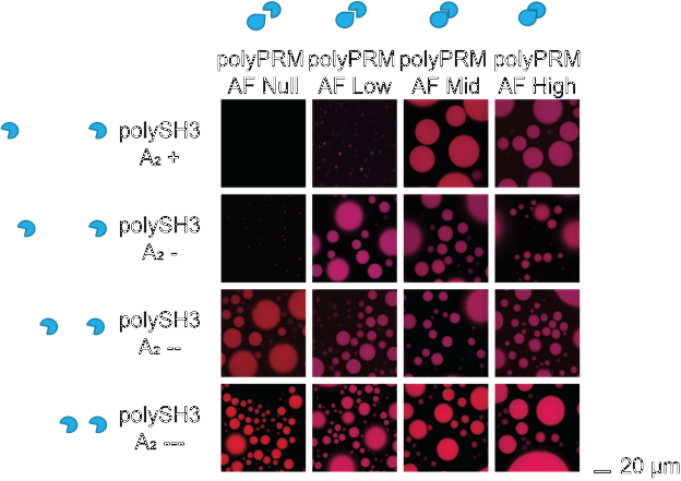
Fig. 6. Images of the experimental results.
This is a full visualization of the above results. While two combinations of SH3 type and PRM type may both form droplets, the number and size varies.
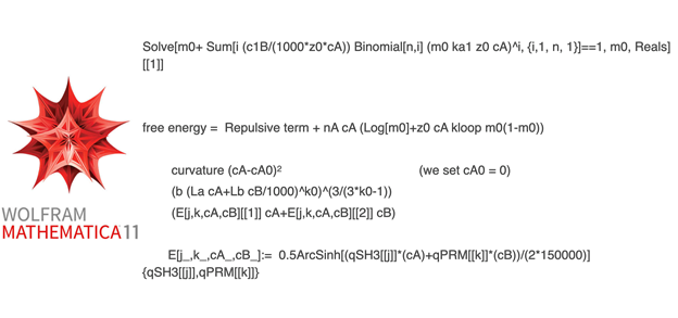
Fig. 7. The various models in Mathematica.
We used Mathematica to do computations with our models, and this is part of that code. First, it finds the number of the stickers which are unbound which will minimize the energy. From there, the number of molecules which are bound to two other molecules, three other molecules, etcetera, can be found
Then, the energy is calculated and plotted for different concentrations of SH3 within the droplet. There’s also a repulsive term in this calculation, corresponding to the different A2 values, which has 3 variations for different models.
The first model, the curvature model, treats the repulsion as being quadratic centered around some concentration, which we have generally treated as being zero. It’s not based on any particular physical model of the repulsion, it was chosen because it’s the mathematically simplest model which might work. The second model is the blob model, which gets its repulsion from how the molecules take up space, mostly with their spacers, and so exert pressure against each other. The third model uses electrostatic repulsion between molecules, which is affected by interactions with surrounding water molecules because water is polar.
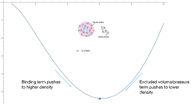
Fig. 8. Free Energy VS SH3 Droplet Concentration, plotting the curve and minimum.
The graph of SH3 droplet concentration vs Gibbs Free Energy shows how we calculated the theoretical concentrations of the droplets. The concentration of the droplet will tend towards the concentration which minimizes the energy, the binding term dominating the energy difference between states below this concentration and the repulsive term dominating above this concentration. Constants in the formulas were manually adjusted to obtain concentrations which match the data.
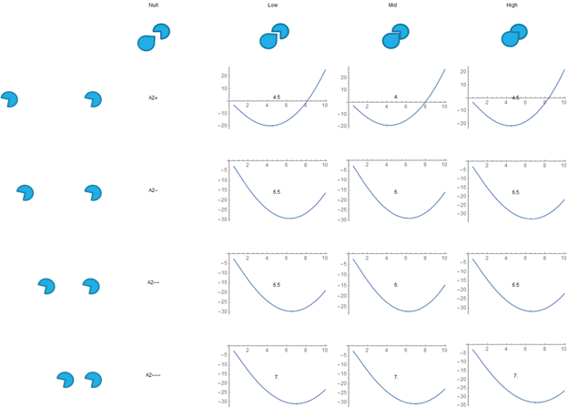
Fig. 9. Free Energy VS SH3 Droplet Concentration, the results for the curvature model.
This is a display of the graphs the calculations gave us for all combinations of SH3 and PRM types, except for PRM Null, due to its lack of reactivity. Different PRM types correspond to different association constants, which are used as inputs in the calculations. The bulk concentration of the PRM is also a unique input for each graph.
We manually adjusted the number of available binding sites per unit volume, which is the same for all graphs, and manually adjusted the strength of the repulsive terms between A2 values.
The number over the center of each graph is the concentration at which the energy minima occurs. This particular graph is for the curvature model of the repulsive term.
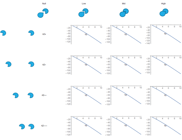
Fig. 10. Free Energy VS SH3 Droplet Concentration, the results for the excluded volume/blob model.
This is for the excluded volume/blob model. No minima forms unless a certain term is adjusted severely. We do not have a good theoretical motivation to change this term to a sufficient degree to improve the results.
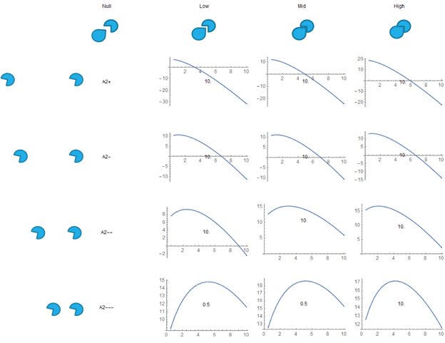
Fig. 11. Free Energy VS SH3 Droplet Concentration, the results for the electrostatic repulsion model.
This is for the electrostatic repulsion model. In this case, the repulsion is TOO strong, so no minima is formed except at 0, and in many cases there is a maxima.
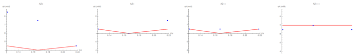
Fig. 12. Graphs of the SH3 droplet concentration VS the association constant of PRM with SH3 for each A2 value. Compares the experimental results (blue dots) with the theoretical/computational fit we found for the curvature model (red lines).
These graphs compare data and theoretical/computational results from the curvature model. The others models only had minima at the extrema of cA, so they couldn’t be meaningfully compared. The fact that the trends are non-monotonic, and that we could match that with our models, is significant.
Acknowledgements
Thanks to Jeremy Schmit & Ashif Akram for their math. And guidance.
Thanks to Rosen group at The University of Texas Southwestern for their data and general collaboration.
Thanks to Kansas State University and the National Science Foundation for the existence of this REU.